Font story: Serif (serif) / Sans-Serif (sans serif) / variable width / fixed width (for coding)
This is a story about a font that can be read lightly. Classification according to the shape of the font and the width of the character, and the appropriate font for each use such as reports, manuals, coding, and blogs.
I have been reading and writing many papers and documents while doing IT consulting for a long time. I'm not an expert in making fonts, but I know empirically which fonts are readable and where they are used. Even now, when a PPT or a manual/instruction/guide document is made with multiple fonts and displayed on the screen, I often review repeatedly which font is most suitable when printed.
Learn about the classification of fonts, look at fonts that are suitable for use when writing PPT documents such as reports, MS Word documents such as manuals/instructions/guides, and coding with SQL/VBA/Python.
1. Font Classification
There are various classification systems for fonts, and they are typically divided according to their shape or according to the width occupied by the characters.
- Divided according to shape: Serif (Myeongjo/Batang type, refined and Buri typeface), Sans-Serif (Gothic/Doldum type type, refined and Minburi typeface)
- Divided according to the width occupied by the text: variable width, fixed width
2. Fonts divided by shape
source: https://newenglandrepro.com/serif-vs-sans-serif-typeface
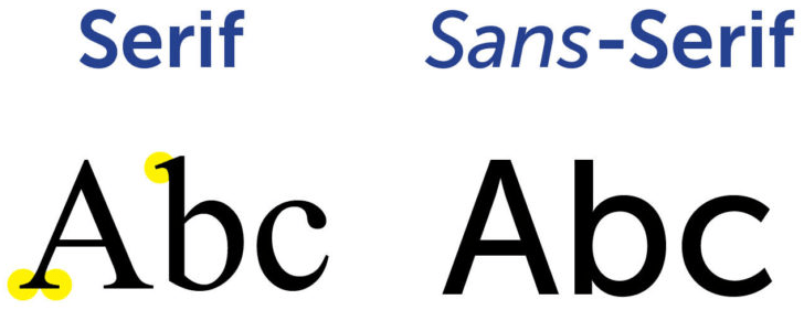
2.1. Serif
Serif refers to the protruding shape of some ends of strokes that make up letters and symbols in typography.
* Source: Wikipedia (https://en.wikipedia.org/wiki/Serif)
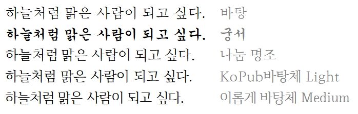
A serif is a font that has a scalloped (embellished) character shape. Windows 10 includes 'Batang' and 'Gungseo' for Korean fonts, and 'Times New Roman' and 'Georgia' for English fonts. Among Korean fonts, '~Batang' and '~Myeongjo' are serif fonts. In Korean, it is called 'Buriche'. In this article, we will refer to serifs.
Serif fonts are easy to read and are suitable for content with many characters. Most book body text is printed in a serif font.
Among the serif fonts released for free use, we recommend the following.
- Nanum Myeongjo among Nanum fonts released by Naver: https://hangeul.naver.com/font
- In October 2020, a trial version of the serif font 'Maru Buri' was released. It is said that the final version of Hangeul Day 2021 will be announced by reflecting user opinions. (https://blog.naver.com/naver_diary/222108486133)
- The KoPub batang font released at the Korea Publishers Conference: http://www.kopus.org/biz-electronic-font2/
- Beneficial body published by Beneficial: https://iropke.com/archive/iropke-batang-launching.html
2.2. Sans-Serif
Sans-serif refers to a font without strokes, and corresponds to the Gothic font of Hangeul. The word sans serif is a phonetic translation of the French word sans serif, which means “without strokes”.
* Source: Wikipedia (https://en.wikipedia.org/wiki/Sans serif)
A sans serif is a font that does not have slits in the shape of the letters. In Windows 10, Korean fonts include 'Gulim', 'Doom', and 'Sunny Gothic', and English fonts include 'Arial', 'Helvetica', 'Tahoma', and 'Verdana'. Among the Korean fonts, '~Gothic' and '~Doom' are sans serif fonts. It is purified in Korean and called 'Minburiche'. In this article, I will refer to it as a sans serif.
Sans serif fonts are usually suitable for bold content, such as titles, summaries, and phrases to be emphasized.
Among the freely available sans serif fonts, we recommend the following.
- Nanum Gothic, Nanum Bareun Gothic, and Nanum Square among the Nanum fonts released by Naver: https://hangeul.naver.com/font/nanum
- KoPub font released at the Korean Publishers Conference: http://www.kopus.org/biz-electronic-font2/

3. Fonts divided according to the width occupied by the characters
3.1. variable width font
The width of the letters is not constant, and it is a different font. The serif and sans serif fonts listed above are all variable width fonts. Variable width fonts are natural and readable.
3.2. monospaced font
A font with a constant width.
A monospaced font (also known as fixed-pitch, fixed-width, or non-proportional font) is a font in which each letter occupies an equal amount of horizontal space. It is also known as monospaced font, proportional font, or proportional font.
* source: https://en.wikipedia.org/wiki/monospace_font
Korean fixed-width fonts included in Windows 10 include 'Gulim,' 'Doom,' and 'Gungseo,' and English fixed-width fonts include 'Consolas,' 'Courier New,' and 'Lucida Console.'
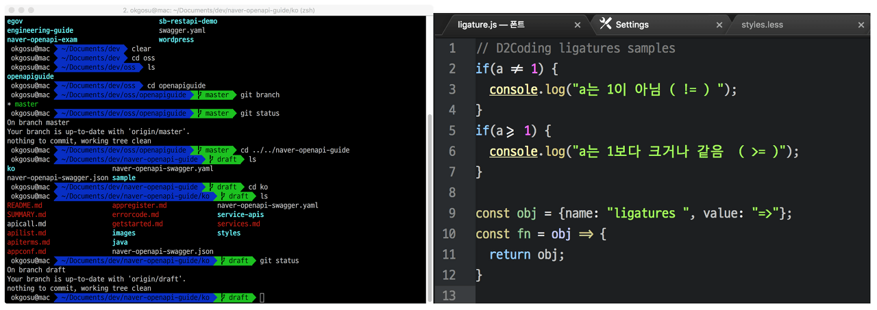
Monospaced fonts are good for coding. It is natural to use a fixed width font for readability when reading source code in the editor of a development tool or to utilize features such as column selection/editing.
Among the monospaced fonts released for free use, we recommend the following fonts.
- Nanum Gothic Coding released by Naver: https://github.com/naver/nanumfont
- D2Coding published by Naver: https://github.com/naver/d2codingfont
- JetBrains Mono published by JetBrains: https://www.jetbrains.com/ko-kr/lp/mono/
For reference, JetBrains Mono does not include Korean. If Korean characters are included in source code strings, comments, etc., it may not be suitable.
The following article, written in detail about monospaced fonts for coding, is also worth reading.
https://ppss.kr/archives/66633
4. Recommended fonts suitable for each usage
4.1. Report (PPT)
Reports are mostly prepared in PowerPoint (PPT). Usually, each company's own template and font are decided and used. The generally recommended fonts according to the report area are as follows.
- Cover: Sans serif fonts (Sunny Gothic, Nanum Barun Gothic, KoPub Doom Font, Nanum Square)
- Heading at the top of each page: Sans serif font (Sunny Gothic, Nanum Bareun Gothic)
- Governing message on each page: Sans serif font (Sunny Gothic, Nanum Barun Gothic)
- Contents of the text: Sans serif fonts (Sunny Gothic, Nanum Bareun Gothic) and serif fonts (Nanum Myeongjo, KoPub Batangchee) are mixed
In general, the report (PPT) should be written in a sans serif font, but it is good to minimize the text and appropriately use figures and images to improve readability.
4.2. manual
Most of the manuals are written in MS-Word or Korean (HWP). This includes product manuals, installation guides, instructions, minutes of meetings, applications, and contracts. The following fonts are generally recommended according to the description area.
- Cover: Sans serif fonts (Sunny Gothic, Nanum Barun Gothic, KoPub Doom Font, Nanum Square)
- Table of Contents Number, Title: Sans Serif (Sunny Gothic, Nanum Barun Gothic, KoPub Dotum Font, Nanum Square)
- Main article: Serif (Nanum Myeongjo, KoPub Batang Font)
Since most of the contents of the manual are letters, it is recommended to write in a serif font that is easy to read.
4.3. coding
Coding fonts must use monospaced fonts.
D2Coding is a coding font that expresses both Korean and English well. I use D2Coding for Excel VBA editor and SQL Tool DBeaver.
If the development tool supports fallback font setting, it is good to set JetBrains Mono as the default font and D2Coding as the fallback font. If you use Pycharm, a Python development tool, this setting is recommended. I have it set like this too.
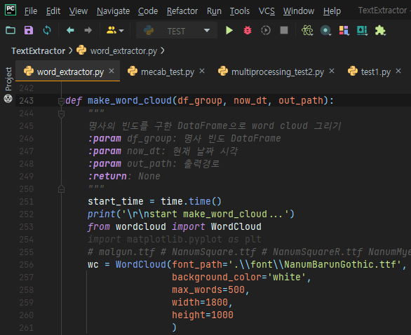
Set as follows in PyCharm > File > Settings > Editor > Font. (Based on PyCharm 2021.1.2 (Community Edition))

The font used in VBE (Visual Basic Editor), an editor of Excel VBA, is written in the following article.
Excel VBA Course (5): Excel File Extension, VBE, Font Settings
4.4. blog
Blogs are very diverse in content, such as daily life, travel, hobbies, and technical research. It can be a lot of text, or it can be a lot of photos or videos. If you have a lot of text, serif fonts are better for readability. If you have more photos and video content than text, sans serif fonts look good too.
The font applied to the old Tistory blog is the serif 'Bangtan font'.
source: https://iropke.com/archive/iropke-batang-launching.html
CEO Kim Eun-joo said, “While building a number of websites, I thought about developing a web font because I thought that a Korean font that expresses text better than a distinctive font that stands out is desperately needed. I hope that 'Bangang Font', which can express the beauty of Hangeul lightly and beautifully online, will be used in various places in many places,” he explained the significance of font development.
Most of the text I write has a lot of characters, so serif fonts are suitable for focused reading. When I first opened my blog, I used 'Bon Myung-jo' among the fonts provided by Tistory, but after looking at it for a while, the readability was not very good.
While looking around other Tistory blogs, I saw that some blogs had good legible fonts applied. Knowing that the font was 'Bangtan Font', I applied it right away.
* 2022-10-10 content added
As I moved from Tistory to WordPress and moved the text, I changed the font to 'Sharing Gothic', a sans serif. I plan to use Nanum Bareun Gothic for a while.
Nanum Barun Gothic: https://hangeul.naver.com/font/nanum
So far, we've looked at fonts incoherently. Lastly, we introduce “Nunnu”, a site that organizes well-known fonts.
Take a look around to see if there is a font you like.